By Catherine Salgado, Minerva Strategies
My first experience working on a rebrand was a great one. Early last summer, Minerva Strategies forged a partnership with the Seattle Milk Fund to create a new brand for their organization.
Seattle Milk Fund has existed for more than 100 years and changing their brand was a hard decision to make. But change wasn’t new to them. The organization was the Seattle Fruit and Flower Mission when they were established in 1907 and they helped people recuperating in hospitals. In 1935, they became the Seattle Milk Fund because they were focused on delivering milk formula to new moms.
Fast forward to 2019. The organization has evolved in many ways and now connects families to educational opportunities that build financial stability and create generational change. A small but mighty team of women leads with a passion to help students achieve their goals. They make childcare more affordable and consistent by offering grants and other services like matching each parent with an advocate and providing professional development opportunities.
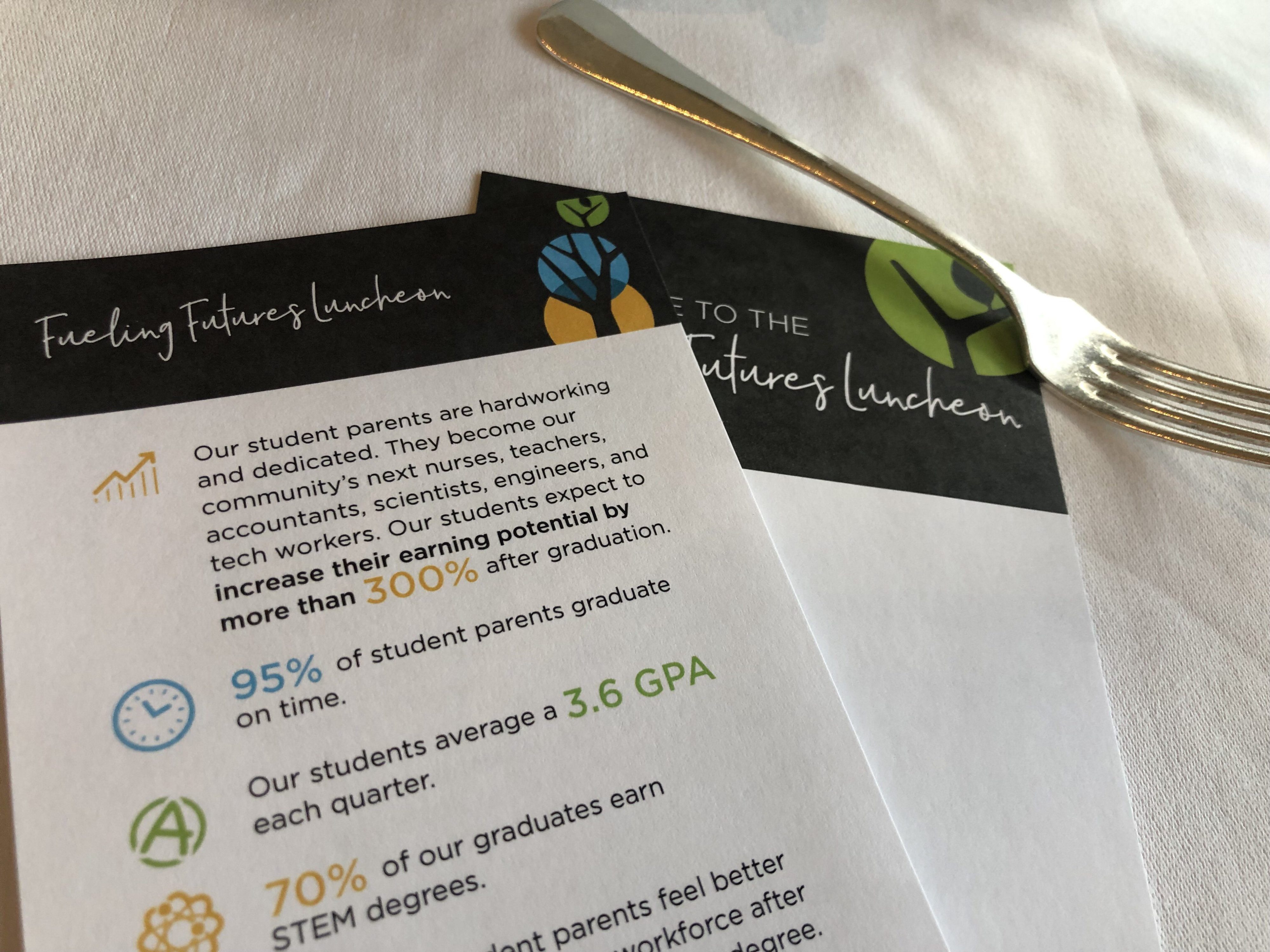
The Seattle Milk Fund brand didn’t reflect this work and the organization wasn’t well-positioned for future growth. The team wanted a rebrand—and fast—in time for their annual Fueling Futures fundraising luncheon in September. This meant that Minerva Strategies had to deliver a new brand for the Seattle Milk Fund within four months.
The process was a lot of fun, full of brainstorming sessions, surveys, focus groups, and meetings with leadership. All of these conversations showed the passion that the staff and donors have for their work and the love and admiration they have for the people they serve.
After rounds of iteration, the organization’s leadership chose a new name and identity: Goodwin Connections. The name celebrates Eda Goodwin, one of their founders, their longest-serving president, and a Seattle trailblazer and a philanthropist who led their first rebrand in the 1930s. They selected “Connections” to reflect the organization’s role as connectors to opportunity and supportive networks for the families they serve.
Following this process, our design partner TEAK Creative developed a stunning visual identity of a brightly colored tree reaching skyward. This represents the hopeful spirits of student parents and their determination to create brighter futures for themselves and their children. The tree and circles symbolize strength, family roots, generational growth, and prosperity.
The name and visual identity were paired with an inspiring tagline to express the full brand—Goodwin Connections: where brighter futures take root.
Minerva Strategies was thrilled to embark on this adventure with the Goodwin Connections team. Helping them develop a new name, visual identity, and messaging frame in a short timeframe was both exciting and challenging. Last week, we were pleased to attend Goodwin Connections’ annual luncheon where the new brand was unveiled to the delight of everyone attending.
We are grateful to have been part of this rebrand and wish the best to Goodwin Connections on what we are sure is going to be a successful future for them and the families they serve!