By Sara Veltkamp, Senior Associate, Minerva Strategies —
Infographics, as in ‘informational graphics,’ have been around for a long time.
Maps, for example, are infographics, and cartography was an up-and-coming career long before we had things like computers, or even the wheel. According to the crowd-sourced knowledge of Wikipedia, the earliest of map-like infographics were cave drawings that plotted out where ordinary people were in relation to the stars. Now in the 21st century, People Magazine is still doing the same thing.
So why do I occasionally come across articles stating that the infographic is a passing fad, and marketers should avoid using them for reasons varying from their questionable SEO value to their dated appearance?
The backlash against infographics is fueled by the fact that they are often not done well. But that shouldn’t deter people from creating good ones.
Is gaining 30 times more readers overrated?
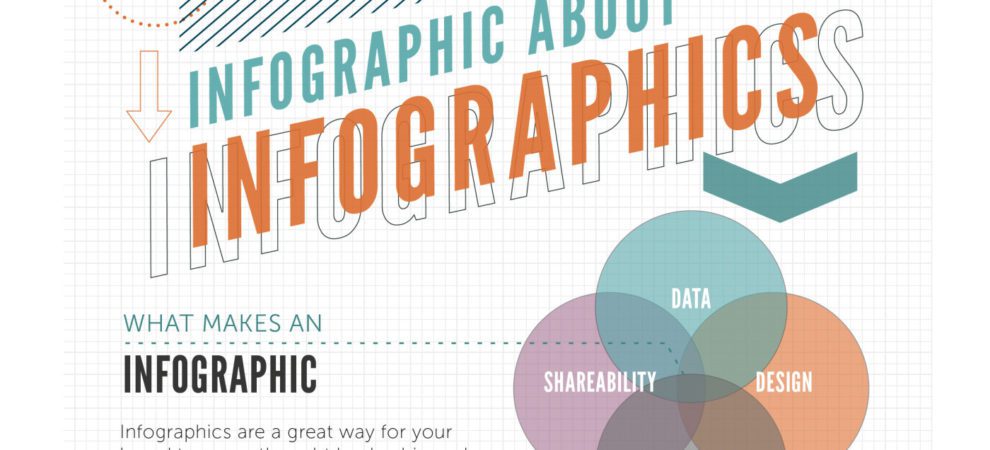
There are numerous reasons to use well-executed infographics. Adweek’s Super Ultra Mega Meta Infographic on Infographics contains helpful insights like 20 percent of text is not remembered, or infographics are 30 times more likely to be read than a text article. Even if the research that produced those stats is only half true, it’s worth paying attention to it.
For those of us who work with nonprofits tackling complex problems, infographics are an opportunity to make data fun and easily digestible. But we have to do it well.
A data point with a cool icon constitutes an infographic, but not a great one. For an infographic to be useful, the graphic has to further the story told by the data. For example, this infographic from Oxfam America, through its use of progressively alarming color and a steadily deflating bag of sustainable income options, visually represents the complex story of food security statistics in an accessible way.
I also am partial to this infographic on the Syrian refugee crisis by Mercy Corps. In a simple, but incredibly powerful way, it graphically demonstrates the breadth of the problem. Note that the infographic represents the refugee crisis in 2013. It would be all the more shocking now.
Infographics are a hammer, not a silver bullet.
So, how can you use infographics to bring power to your cause? The trick is to see infographics as part of your overall storytelling and strategy, rather than a silver bullet that alone will win you friends, followers, and donors. This belief is likely at the heart of PR and advertising professionals’ disillusionment with the medium.
Infographics, like all good content, need to be supported by things like a user-friendly website with clear calls to action, a strong brand and messaging backbone, and effective text and visual storytelling. They are not the silver bullet, they are just a tool, albeit an effective one.
Tips for creating infographics:
1. Always think about the story you are trying to tell and choose graphics, statistics, and colors that effectively tell that story. Do you want people to understand why educating girls leads to better health for their children? Then use colors, graphics, and stats that support this hopeful point.
2. Make different sizes for different platforms, or make each section of your infographic croppable and standalone so that relevant information shows up properly in-stream on Twitter, Facebook, or any other platform you are using. Check out the infographic below, where we can’t see the title and very little information can be drawn at a glance. Now compare that to this infographic, that looks like it was designed for Twitter and where the story of the data is clear: The giving season is a big deal!
  I find this always up-to-date image size Google doc from Sprout Social an indispensable tool when sizing visual content for sharing on social media.
3. Find some infographics that do a good job of telling a story and take note. Here’s a good start from Classy.org.
4. Use free or cheap tools to create infographics like a pro. If you have the resources, provide your social media manager with the limited training necessary to use tools like Piktochart, Photoshop, and Canva.
Finally, Nonprofit Tech for Good gives some great tactical tips for creating and disseminating infographics, a few of which I’ve already highlighted.
Happy storytelling!